Background
The AntiMedia is an online, independent news source that has a following of over 2 million people between their Facebook page and website. This independent news source believes in going away from the grain of mainstream news and covering anti-establishment stories.
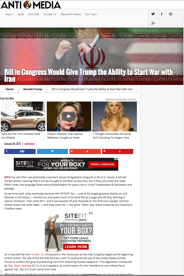
Old Design
The Challenge
The Antimedia wanted a more clean and robust web experience for their users. Their old site was dated and had an ad-hoc website structure from the six years of their existence, so it was it was due for a complete website redevelopment and design. The overall look and feel of the site was a little confusing and not consistent to their brand.
Research
One important organization goal was to increase engagement and retain more users on the site by allowing users to curate their own independent news with up and down votes and allow some functionality with the user profiles.
These were few of the many new features they wanted to implement on their new website, but this product launch would only consist of the base functionality of the voting system to get rolling. The client believed that users want to curate the news and see the most trending and highlighted news from their editors, partner news sources, and user-submitted news links.
Going ahead with the design process, I kept these goal-oriented questions in mind:
How do we design a pleasant user experience by implementing the voting system?
How do we design a functional site that easily delivers content that is curated by the users?
Verify Assumption of Social Proofs
Before going too far into design conception, I introduced some lite UX practices to help create this brand new web experience. First, I conducted brief online research that would support why this news curation feature is justifiable.
With a little online research, the Creative Bloq talks about the importance of implementing a vote to promote/ social design pattern in products. They allow for better crowd-sourced content curation, like Reddit and Digg. User sourced content gives the users more say in what they want to see and allows for better curation to bring up the best articles from the rest.
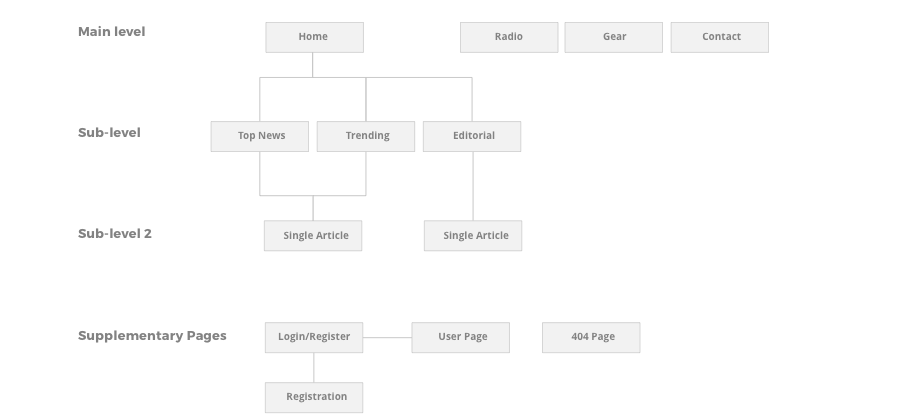
Information Architecture
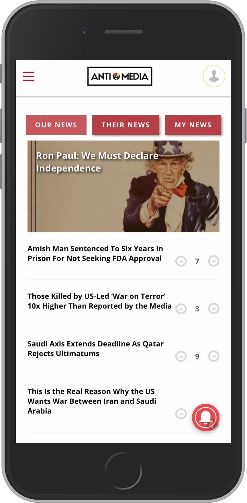
Following through with the assumption of giving users control of the news curation, the new site’s content will revolve around top trending, most relevant, editorial contributed articles, and user submitted news. With that, the architecture was simplified down to only three supporting sections: “Editorial”, “Top News”, “Trending” to fulfill the main goal of curated independent news.
Lo-Fi Prototypes
1: Quick Select the News Type
2: View Number of Comments for Social Element
3: Up/Down Vote System to Promote Social Interaction
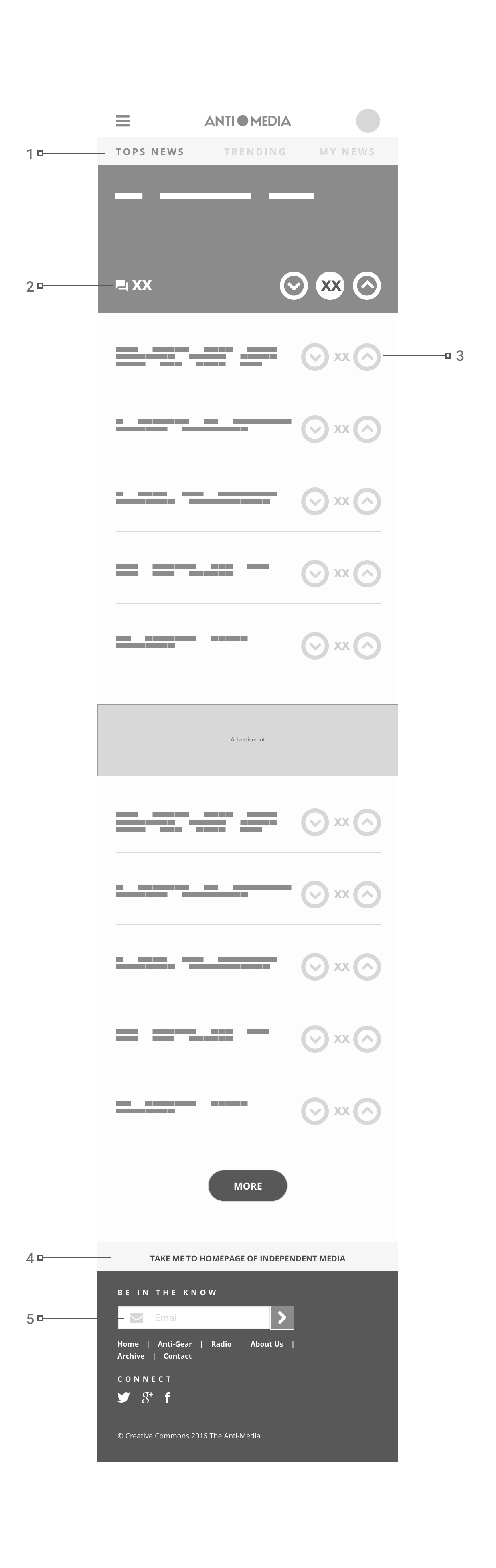
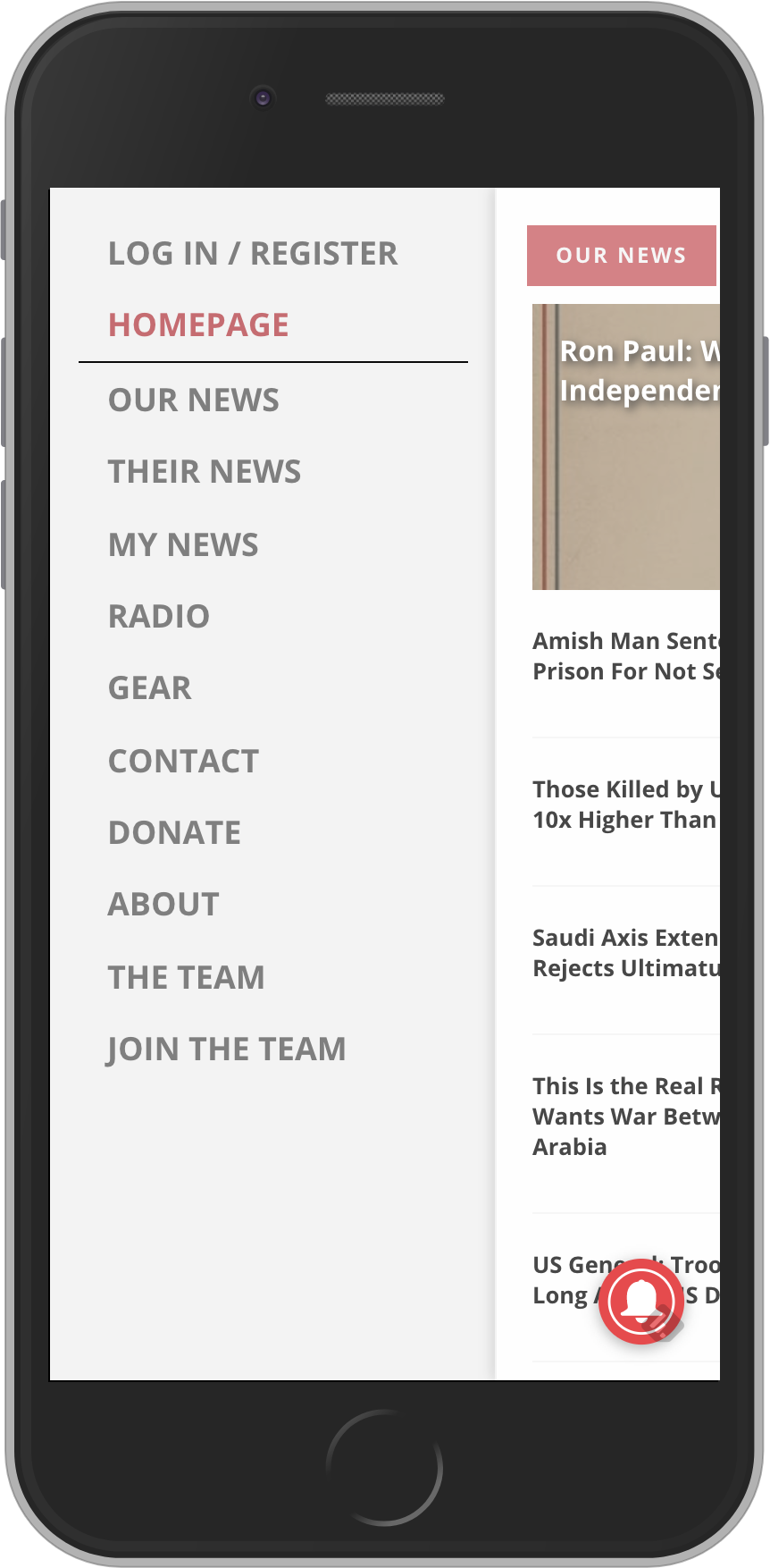
4: Quick Link included on all web pages to Go Back to Homepage
5: Call-To-Action to increase email sign-ups and promote brand awareness in another marketing channel
Hi-Fi Designs
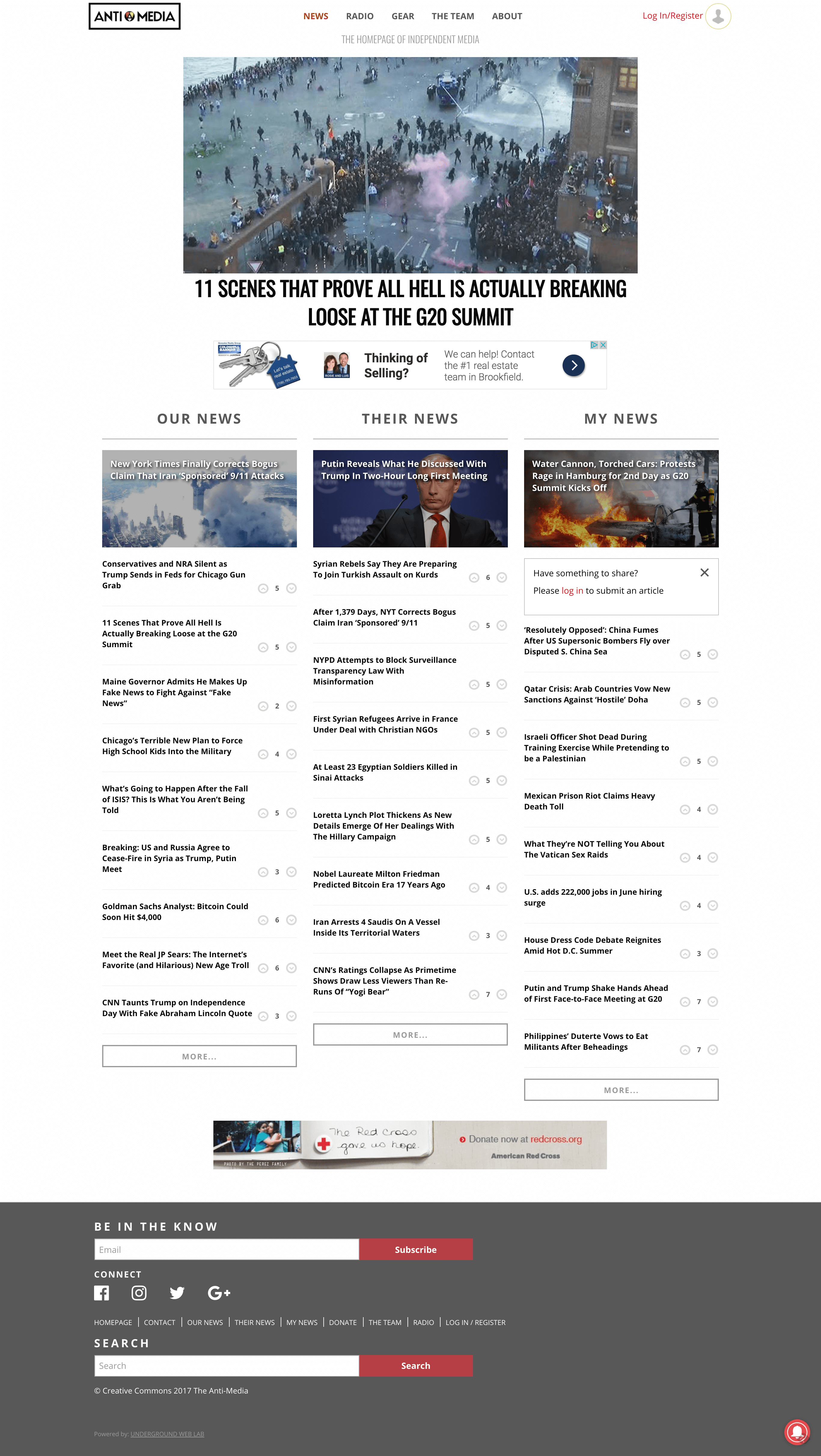
New Design
Guerrilla Testing & Review
After the initial design results, we completed some internal review to understand the page flow and find any key issues. There was some difficulty distinguishing the supporting section titles mentioned before. They were unclear and we had to redefine what the purpose of each section, then renamed the section titles to “Our News”, “Their News”, and “My News”.
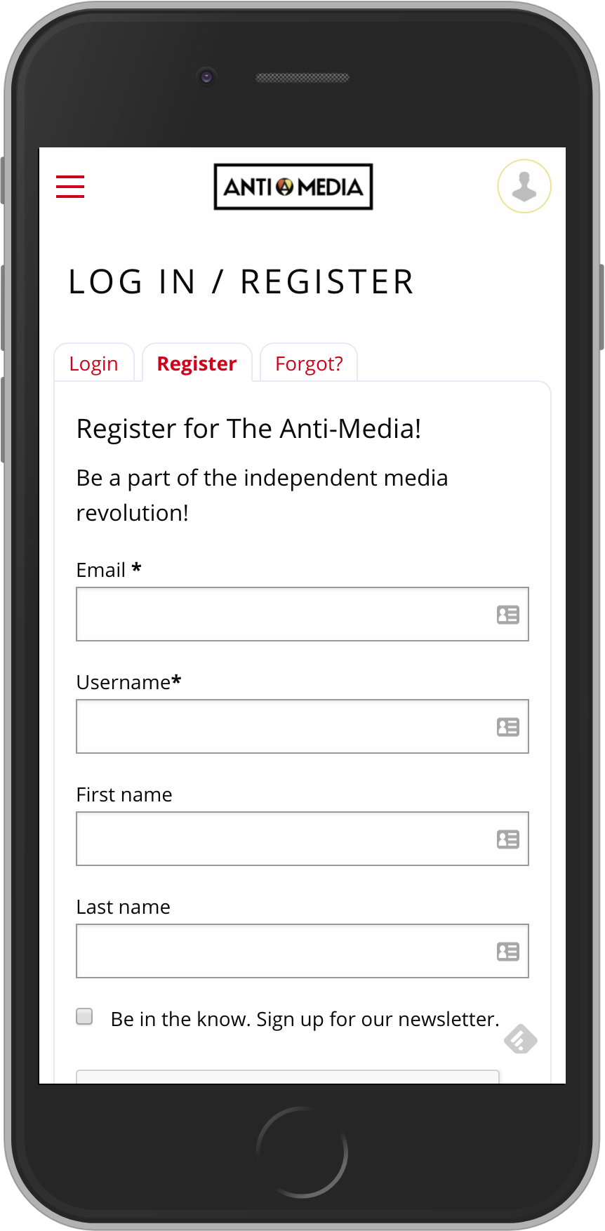
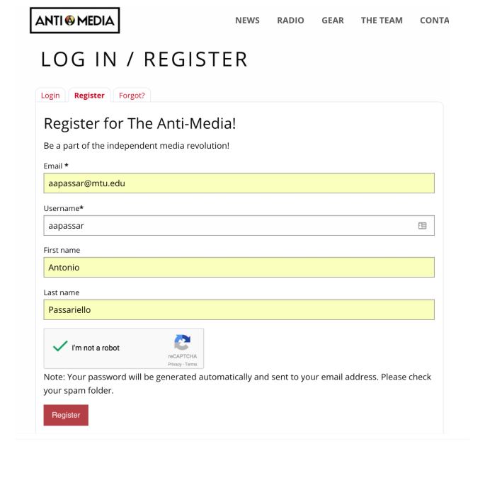
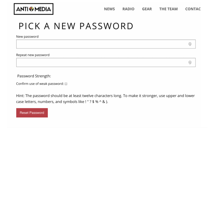
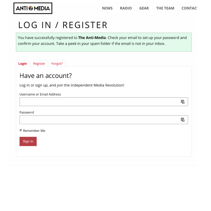
Another pain point we discovered was the Login/Sign-up process. Two out of three testers had troubles signing up because they would rush through the sign-up process by clicking on the email verification link and then skipping over WordPress's default, generated-password page quickly. This caused them to unknowingly skip over the provided password and not have the password for the next login page. They would then have to reset the password and redo the password setup again - simply an unfriendly process. One person even had to reset it twice.
So we redesigned the sign-up process by bypassing the WordPress default signup and having the password sent to the users via email. This would prevent users from rushing through the signup process and not risk losing the default generated password.
Future Improvements
With this new web experience, we have to make sure that the users enjoy it and don’t have any confusion with navigating around the site. To understand how they feel about the site, we could conduct a survey that gives the users the chance to rate the new experience and leave any comments. Through this user feedback, we could identify small and large design problems for improving the site experience.