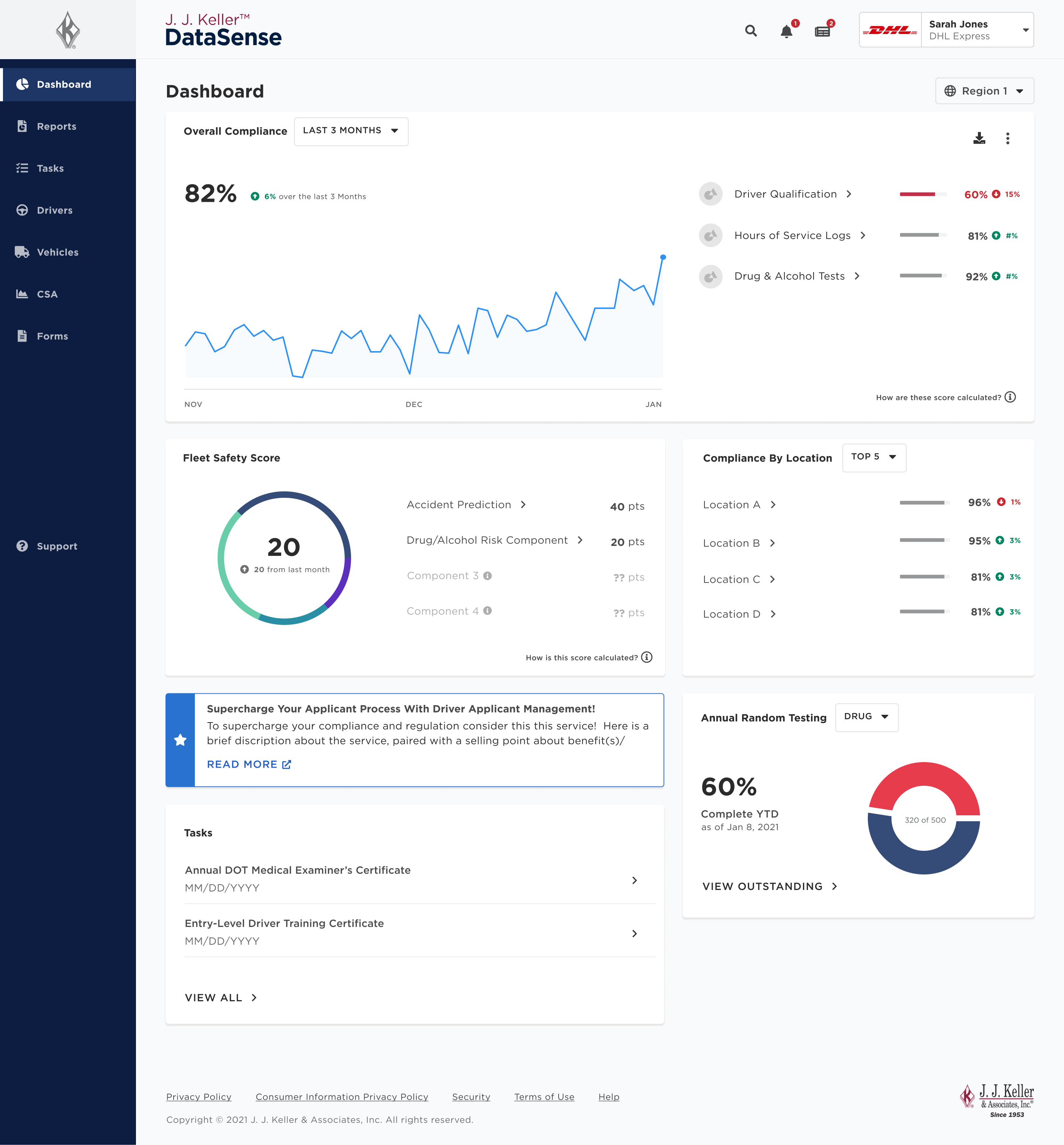
At J.J. Keller & Associates, I led the redesign of their compliance reporting app, modernizing the look and streamlining the navigation system.
Year
Feb 2020 to Feb 2022
Role
Lead UX Designer
Main Contributions
Information Architecture, Prototyping, User Flow mapping, UX Walkthroughs, Usability Testing (Unmoderated), HiFi Design Delivery
Team
Several PMs & ENG teams, Business Analysts, & UX Designer
The Brief
Business Goal
Launch the DataSense platform with a differentiated customer experience for their Managed Services clients and Compliance Specialists, and improve client engagement and satisfaction.
Other KPIs (Not shown in study)
- Rebrand Client Information Center to DataSense.
- Aggregate compliance statistics for several services.
- Build more value-added product features to accompany Managed services offerings.
An Outdated Navigation System Frustrating Users
Learning from Customer Sentiment
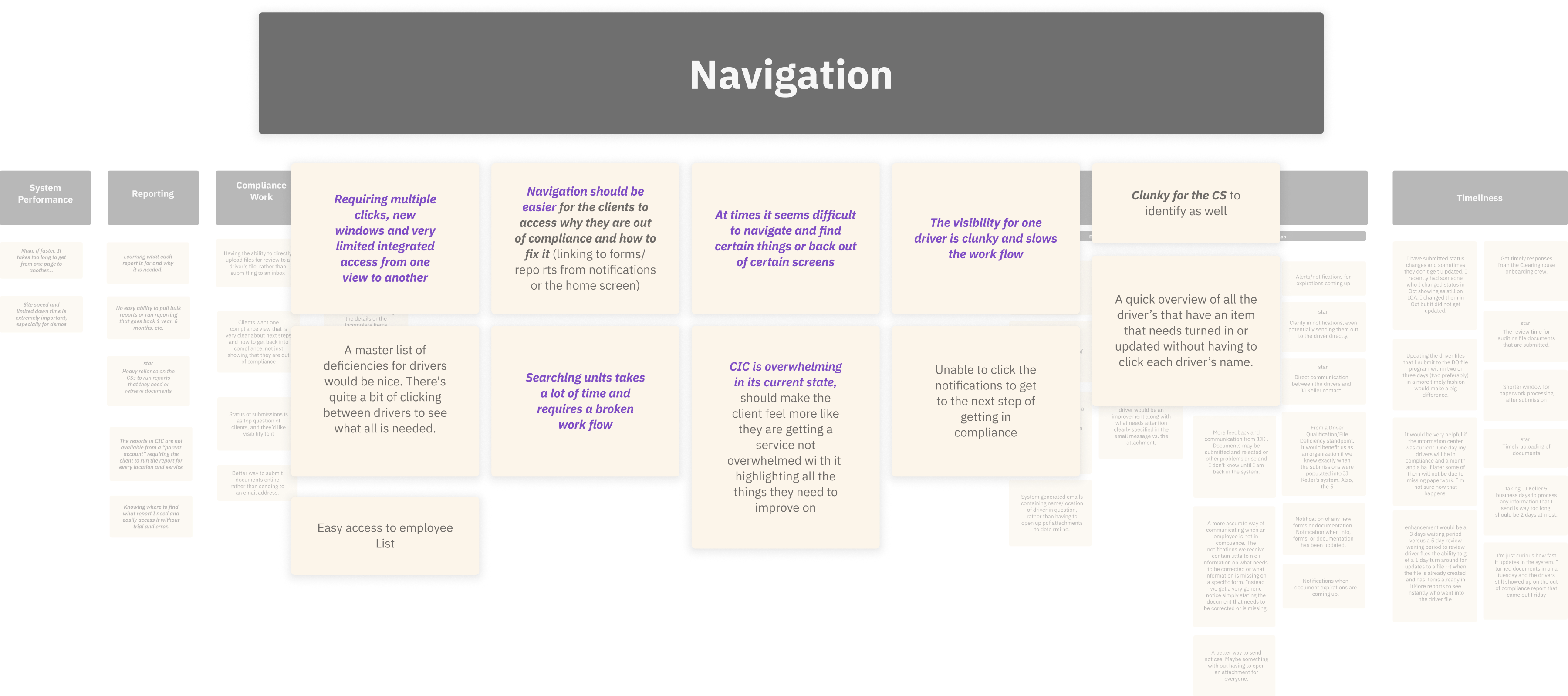
Early in the project’s lifecycle, I reviewed client feedback from a qualitative study and identified key themes, one primary theme was navigation challenge.
Key Insights Guiding the Transformation
Referenced a few key quotes to help inform direction & early design ideas:
“Very limited access from one view to another ...”
“Difficult to navigate and find certain things or back out of certain screens ...”
“Visibility for a driver is clunky and slows the workflow...”
Uncovering the Flaws in the Current Information Architecture
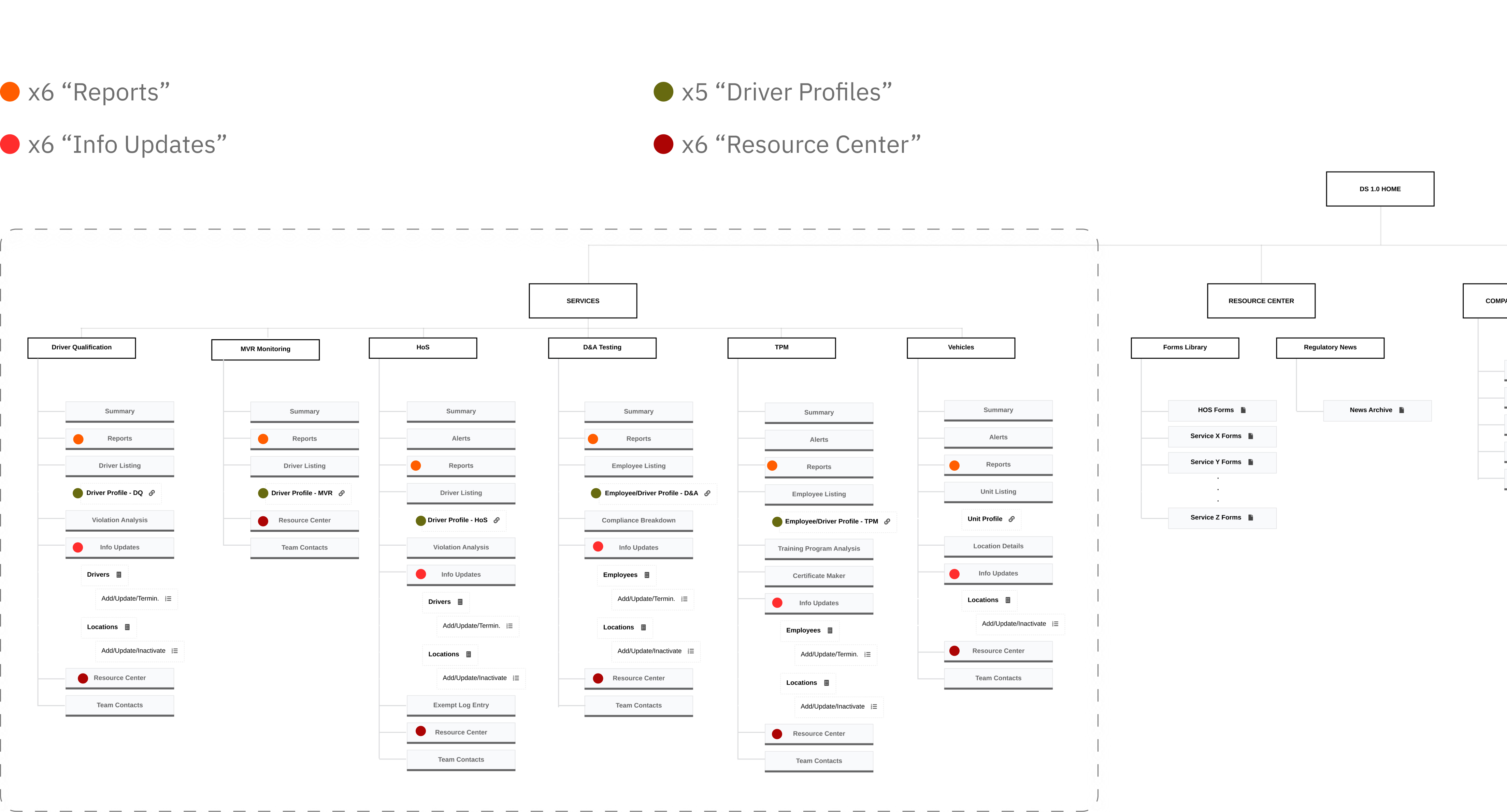
With the insights in mind, I investigated the legacy system’ experience and IA to better understand the user sentiment, and identify some of the more obvious UX issues.
usability issue
Many redundant webpages : more surface area to way-find for info (or get lost)
Example Areas:
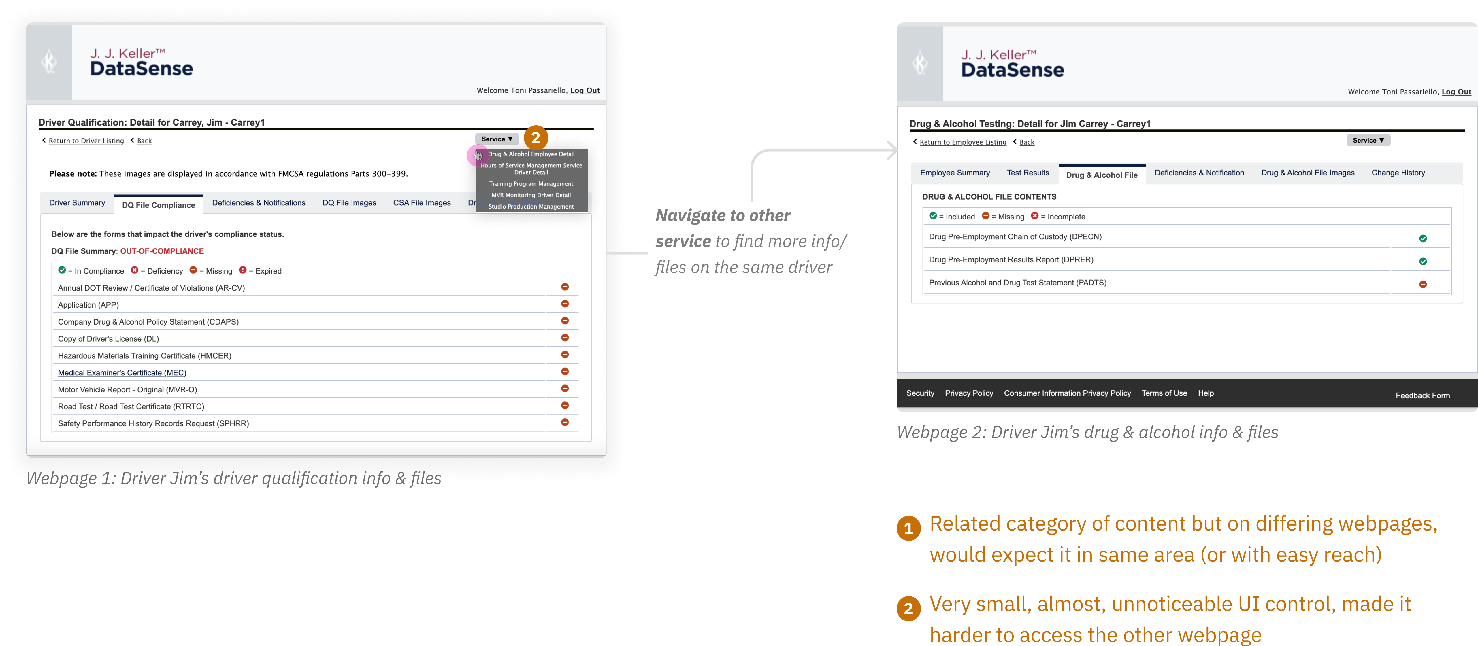
usability issue
Related Information/Features are siloed : Harder to find content for user
When looking for info and files on a single driver, you’re required to visit multiple profile pages (one per service) to find what you need.
Conceptualizing a Streamlined Navigation System
Laying Down a Rough Foundation
From the user insights, audit, and UX best practices, I led the conceptualizing of new navigation system with the thinking of:
Eliminating Redundancies
Consolidate repeated and related content into one channel (or subpages) to create a more streamlined and cohesive system.
Creating Intuitive Top-Level Channels
Group available content in system by primary topics and which users should easily relate to.
Over the course of ~5 months
Identifying Users' Information-Seeking Behaviors & Needs
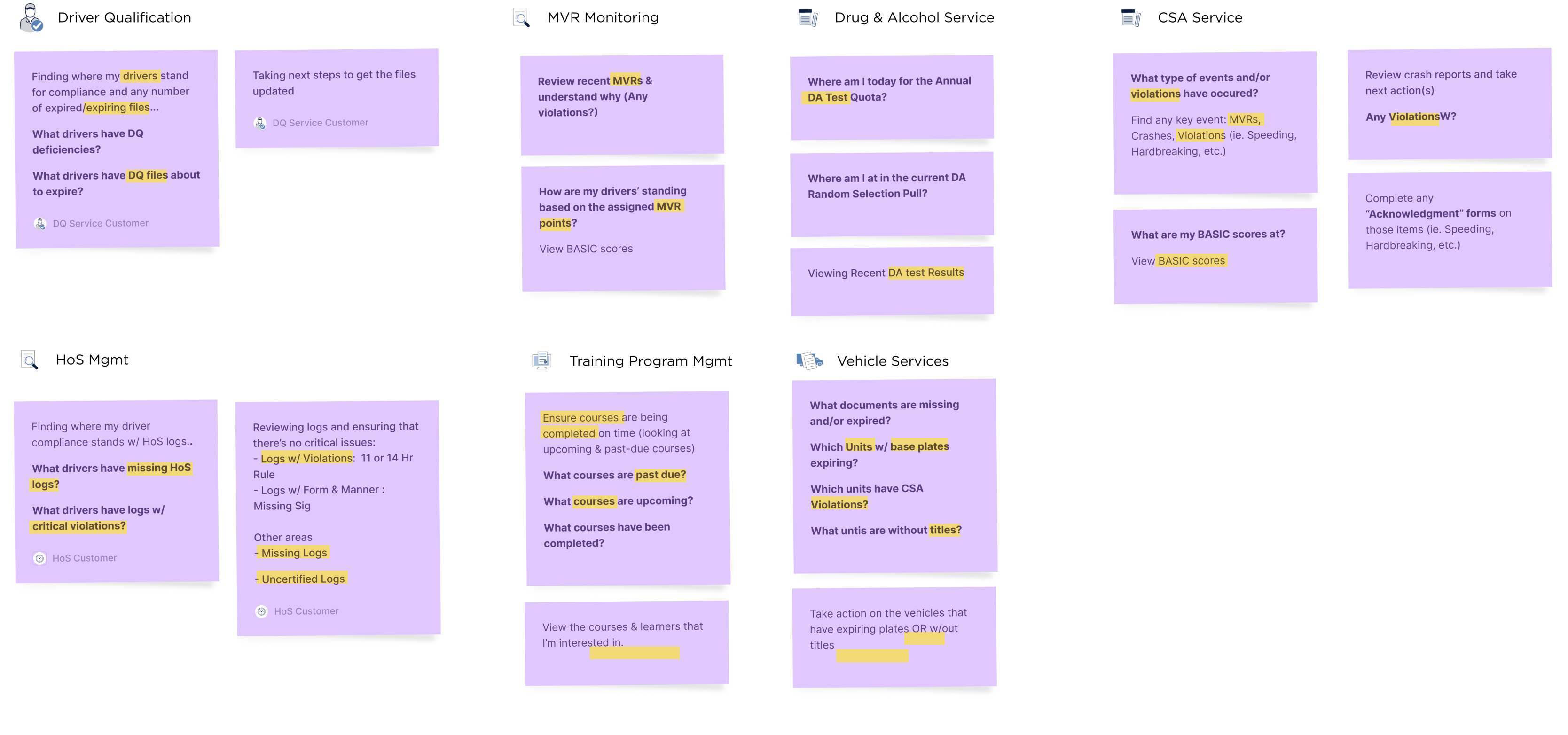
Throughout the project's waterfall execution, I conducted stakeholder interviews every two to three weeks for each of the 7 business service offerings. My focus was honing in on user goals and information-seeking behaviors and continually iterate on my design approach.
Iterating on New Navigation System
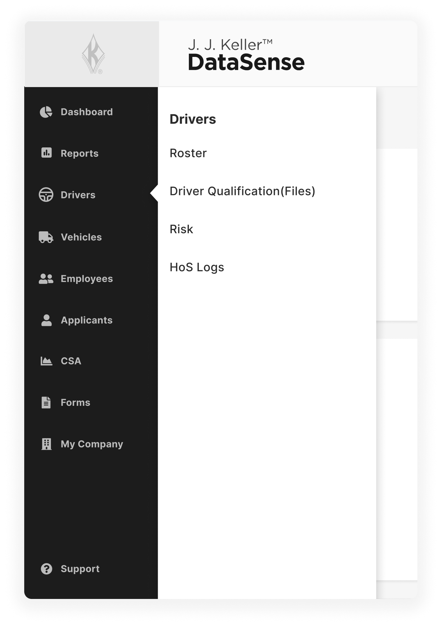
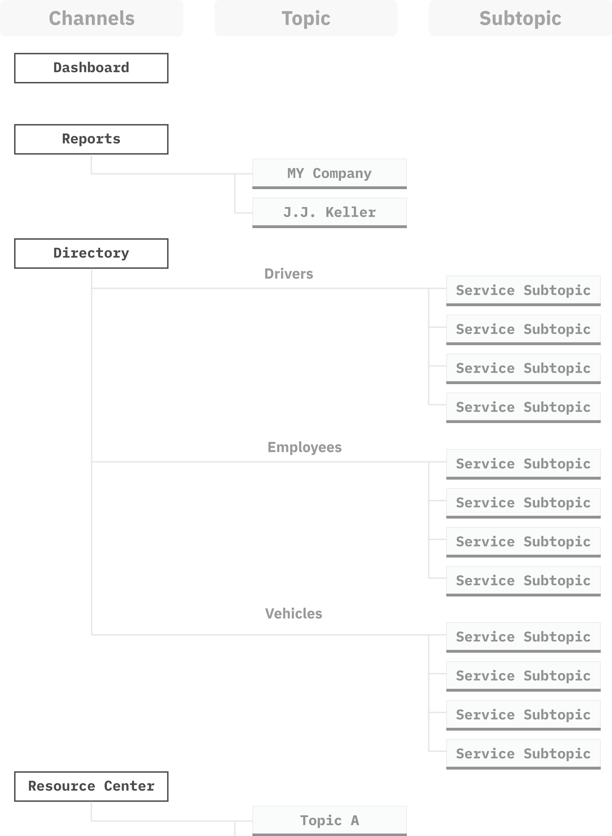
After reviewing all services, I refined the navigation design concept.
Applying New Learnings
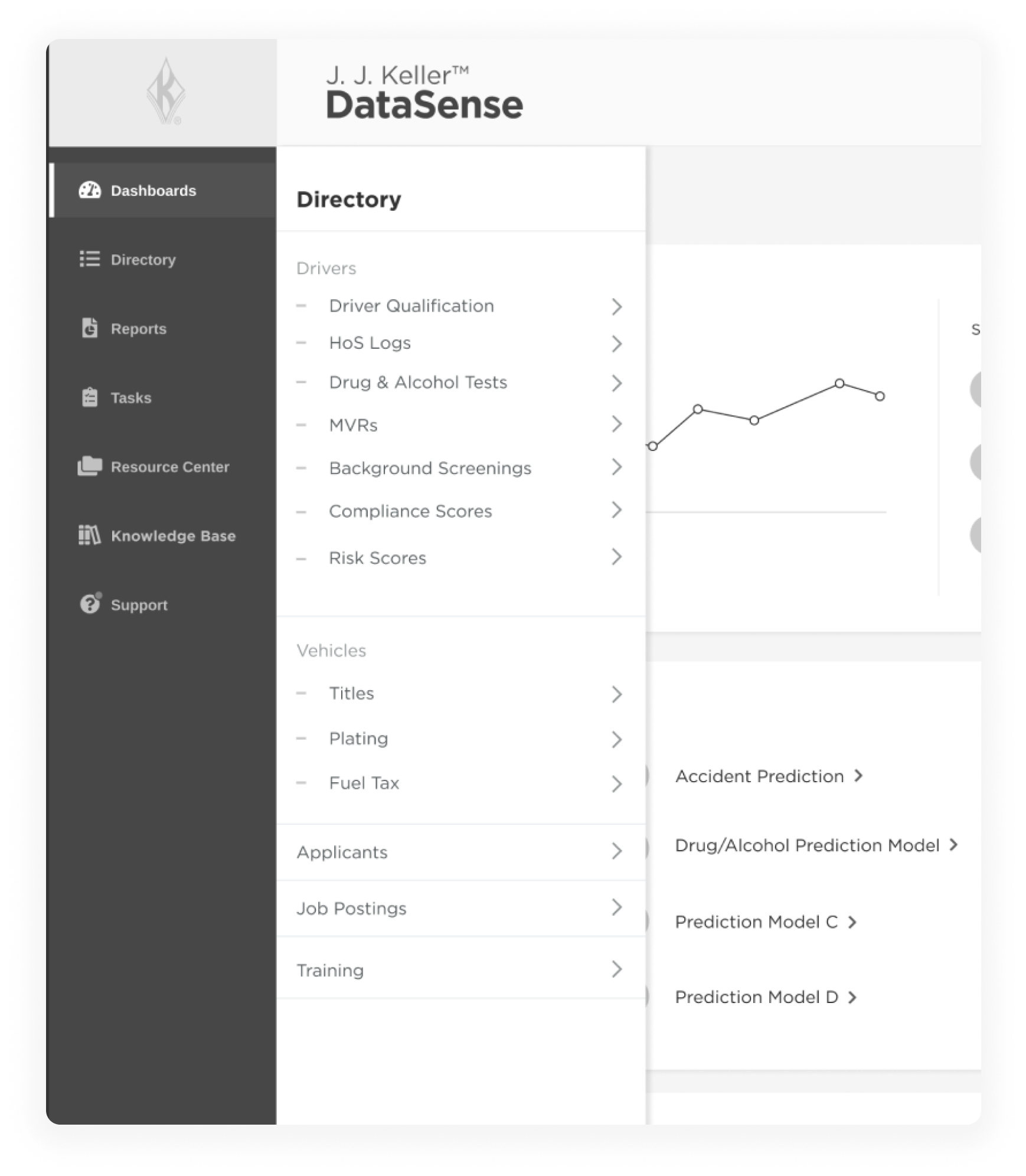
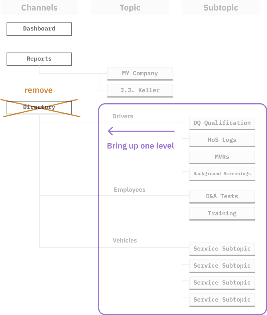
- Adding more sub-topics into IA sitemap for “Directory”
- More Consolidation of existing content into a “Support” channel
Pivoting on the Design
Realized too many sub-topics under “Directory”, so I worked with team to resolve by moving a few topics up a level for more visibility/accessibility.
Finished Concept
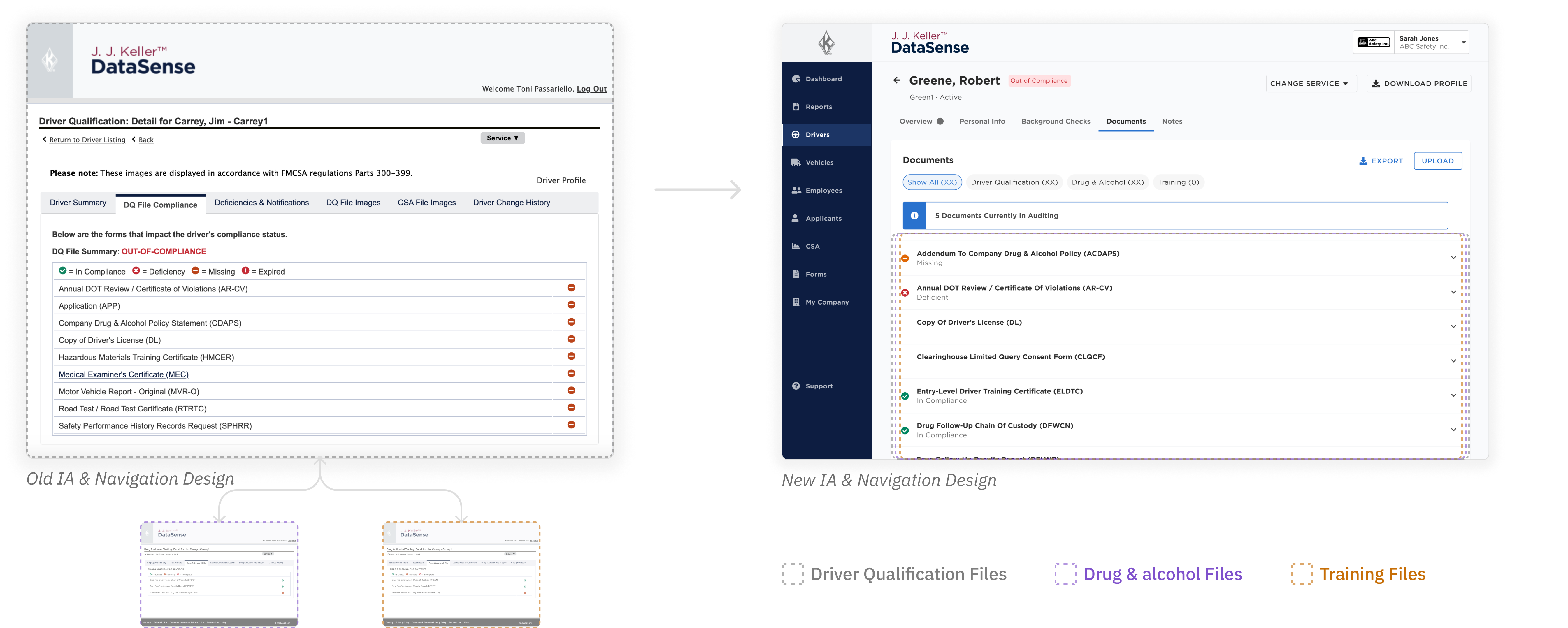
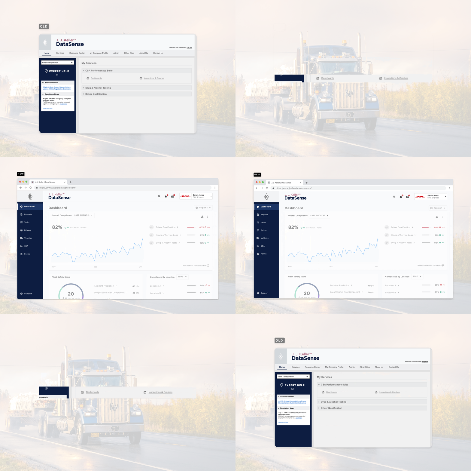
Old vs. New: A Visual Transformation
Driver Profile : showcasing a new breath of visual life and vast difference in IA where content is consolidated into one streamlined experience.
Validating Our Approach
A/B Testing for Success
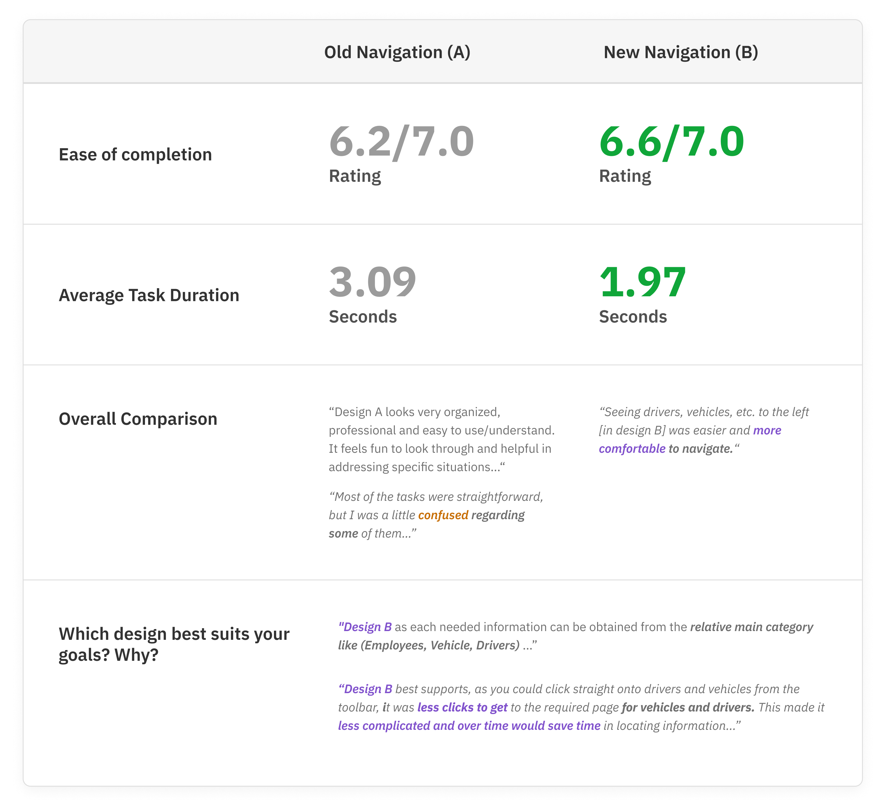
Next, the lead UX designer and myself created a research discussion guide to guage the usability of the prototype design with our stakeholders. The product owner and lead UX facilitated the focus group while I took notes.
measuring success on
Task completion rates
Speed of completion
Users' impressions
Seeing the Impact
Customer Sentiment
“Seeing drivers, vehicles, etc. to the left was easier and more comfortable to navigate ... "
“ less clicks to get to the required page for vehicles and drivers. This made it less complicated and over time would save time in locating information ... "
Business Impact
Reviewing Google Analytics, some metrics suggests there could be an increase in user engagement as Page Views and Avg. Time on Page were increasing after navigation updates.
Mar 1 - AUg 1, 2021 VS. Last period.
Driver Listing Page
32.44%
Page Views
10.72%
Avg. Time on Page.
Driver Profile Page
20.47%
Page Views
9.93%
Avg. Time on Page.
DataSense: Home Dashboard
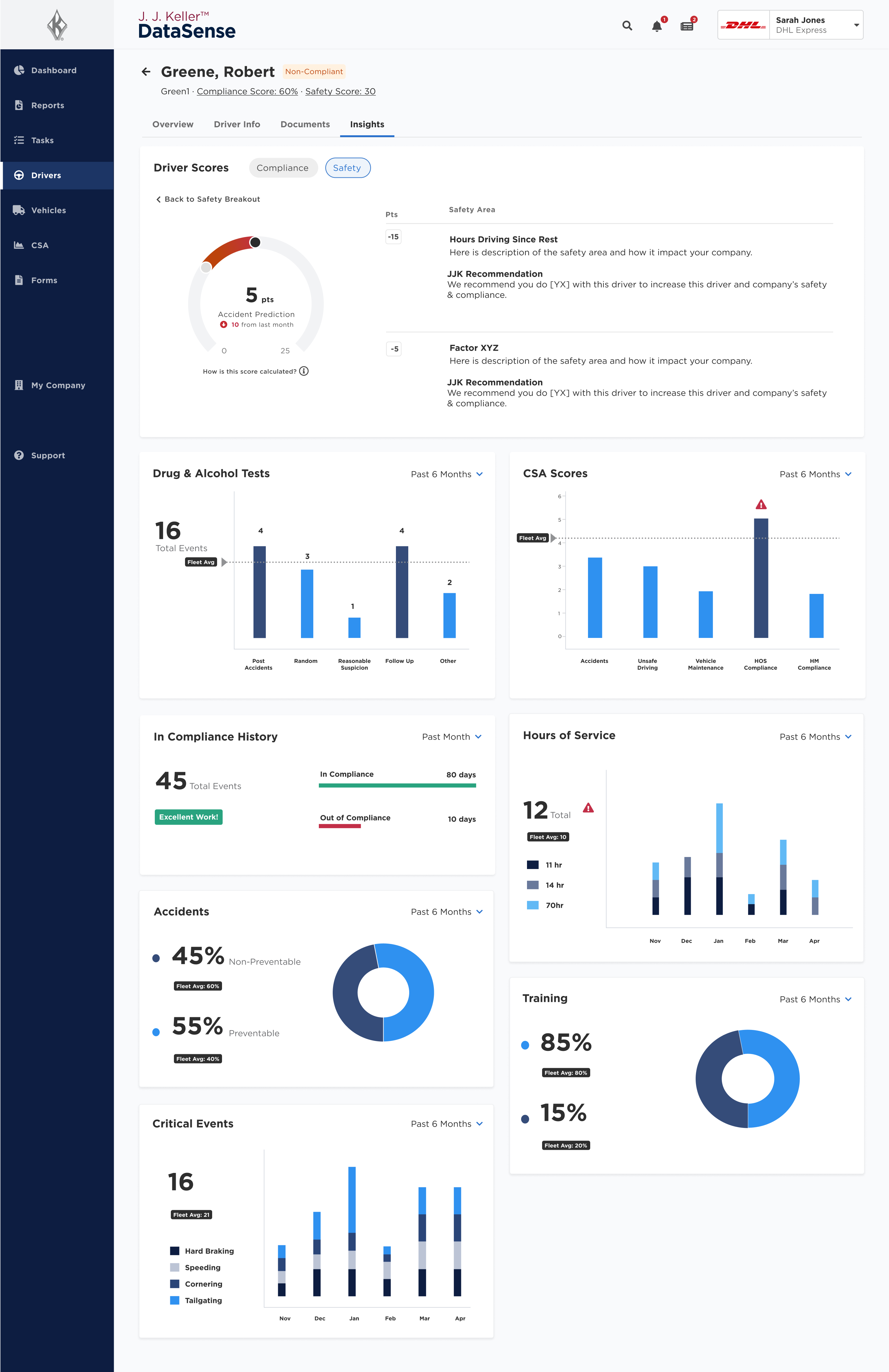
DataSense : Driver Profile / Insights
Reflections and Takeaways
The process of redesigning the navigation system presented a few challenges and key learning points:
Expand testing for more insights & less guesswork
If more time was available, I would advocate for more A/B testing or tree-testing earlier on, so we could evaluate all the channels/areas we didn’t test for in the new design.
Data measurements are fuzzy with limited resources
The system didn’t Google analytics data tags in place to determine precise data on key interactions to know if the new design attributed to increasing results. If provided more resourcing to implement tags, we’d been able to measure the design impact more precisely.
Managing Parallel Work and Balancing Context Switching
Working on this in parallel with other product initiatives led to frequent context switching and having to recall where I left off. This highlights the importance of better UX project segmentation and focus.
Other Notable Outcomes
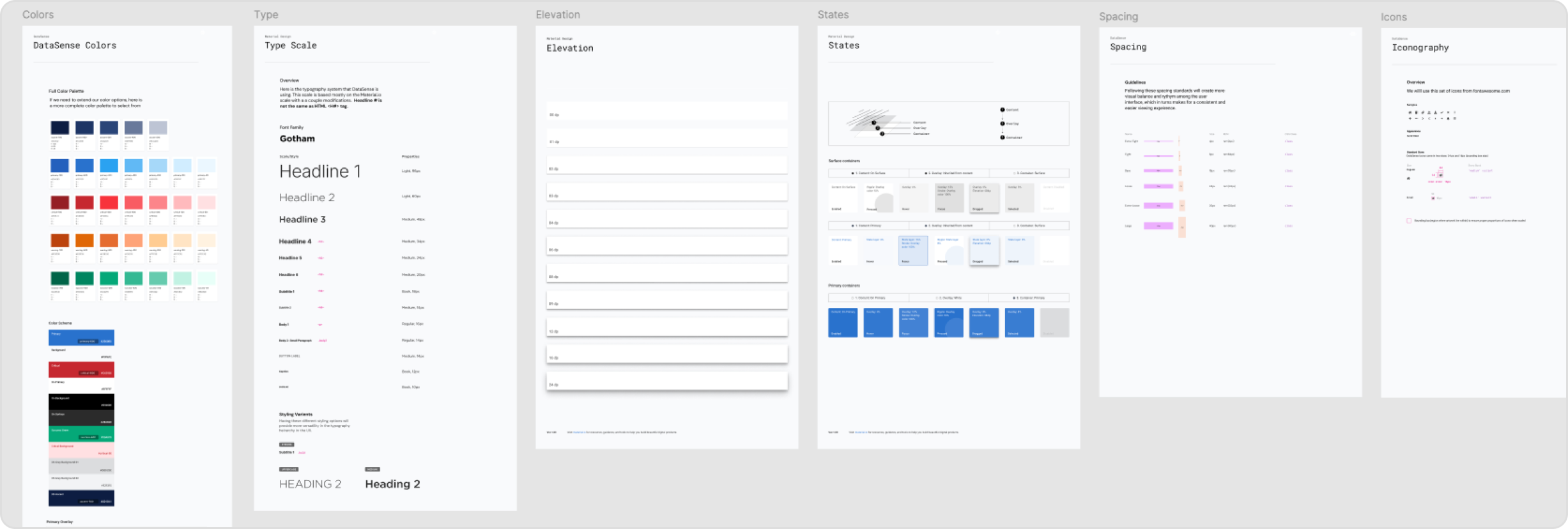
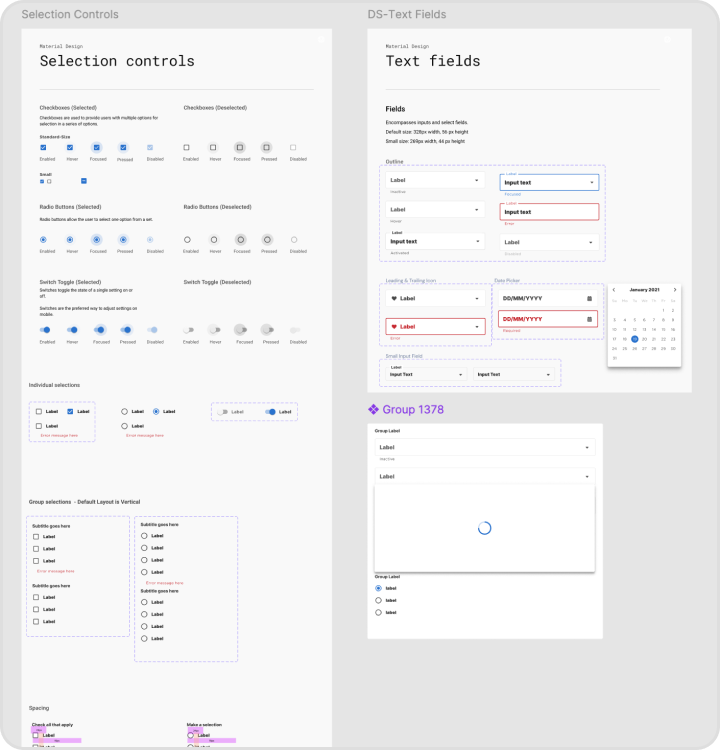
DS Design system
Designed, managed and then implemented with ENG team,making us more efficient / save time to build UIs.
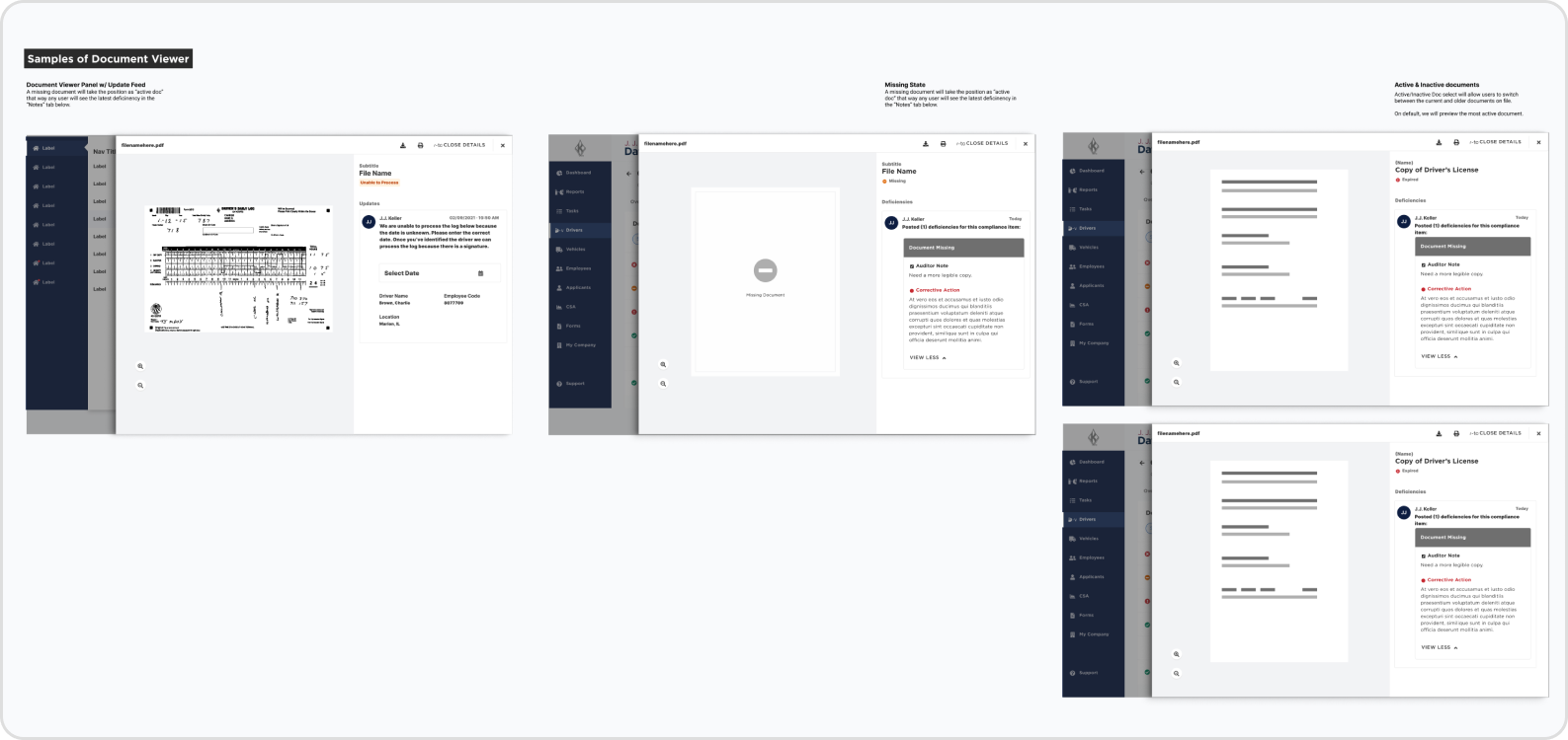
Enhance UX and workflows for 7 services
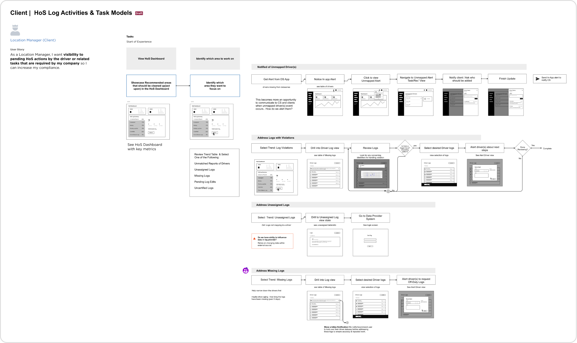
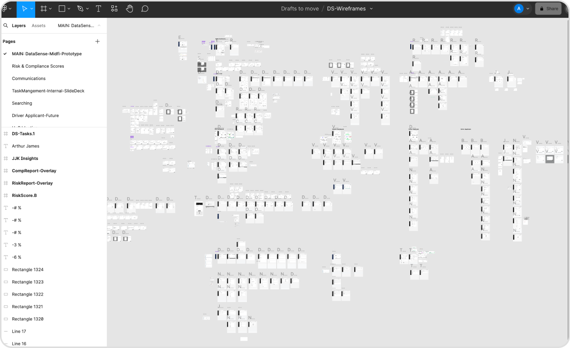
Few snapshots of the design work I led, from drafting task flow diagrams to wireframing, protoyping, and hi-fidelity designs.
